آموزش ساخت تصاویر تبلیغاتی حرفهای غذا با هوش مصنوعی
۱ پرامپتاکتبر 27, 2026
دربارهی این پرامپت
اگر صاحب رستوران، فستفود یا کسبوکار غذایی هستید، یا در زمینه طراحی تبلیغات فعالیت میکنید، با استفاده از این پرامپت میتوانید تصاویر معمولی محصولات غذایی را به پوسترهای تبلیغاتی حرفهای و چشمگیر تبدیل کنید.
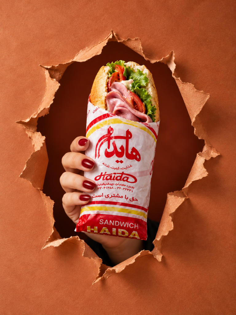
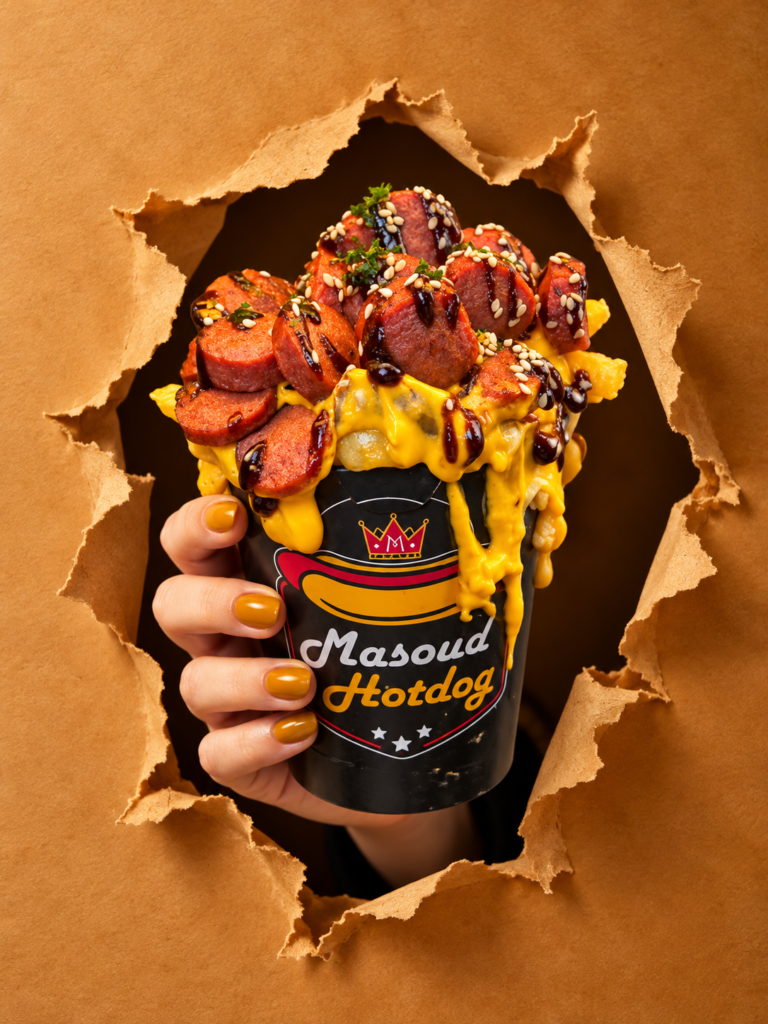
در این تکنیک، محصول غذایی شما به شکلی خلاقانه از میان یک دیوار پارهشده بیرون میآید و توسط یک دست ظریف زنانه نگه داشته میشود. نورپردازی استودیویی، بستهبندی اختصاصی و هماهنگی رنگها باعث میشوند تصویر نهایی ظاهری شبیه به کمپینهای تبلیغاتی برندهای بزرگ داشته باشد.
چگونه از این پرامپت استفاده کنیم؟
مرحله اول: انتخاب تصویر محصول
ابتدا یک عکس واضح و باکیفیت از محصول غذایی خود انتخاب کنید. این محصول میتواند همبرگر، پیتزا، ساندویچ، مرغ سوخاری، شیرینی، دسر یا هر خوراکی دیگری باشد.
هرچه جزئیات مواد اولیه و بافت غذا در تصویر مشخصتر باشند، هوش مصنوعی میتواند ظاهر محصول را دقیقتر بازسازی کند.
مرحله دوم: آپلود تصویر در ابزار هوش مصنوعی
عکس محصول را در ابزار تولید تصویر موردنظر خود آپلود کنید و پرامپت انگلیسی را همراه آن قرار دهید.
در این پرامپت تأکید شده که هوش مصنوعی باید شکل اصلی غذا، ترکیبات، رنگها و جزئیات ظاهری آن را تا حد امکان حفظ کند و محصول متفاوتی جایگزین آن نسازد.
مرحله سوم: تنظیم خودکار رنگبندی تبلیغ
یکی از مهمترین ویژگیهای این پرامپت، سیستم Adaptive Color Palette یا رنگبندی تطبیقی است.
به این معنی که هوش مصنوعی با بررسی رنگهای اصلی محصول، ترکیب رنگ مناسبی برای پسزمینه، دیوار، بستهبندی و حتی لاک ناخن انتخاب میکند.
برای مثال:
همبرگر: قهوهای گرم، زغالی و طلایی
مرغ سوخاری: زرد طلایی، کهربایی و کاراملی
سالاد سبز: سبز زیتونی، سبز جنگلی و کرم
دسر توتفرنگی: صورتی ملایم و قرمز تمشکی
کیک شکلاتی: قهوهای تیره، موکا و کاراملی
به همین دلیل میتوانید از یک پرامپت برای محصولات غذایی مختلف استفاده کنید، بدون اینکه تمام تصاویر رنگبندی یکسانی داشته باشند.
مرحله چهارم: ایجاد جلوه دیوار پارهشده
در این بخش، هوش مصنوعی یک دیوار یا پوستر کاغذی پارهشده ایجاد میکند که غذا از میان آن بیرون آمده است.
لبههای خمشده کاغذ، سایههای طبیعی و عمق ایجادشده در قسمت پارهشده باعث میشوند تصویر حالت سهبعدی و واقعی پیدا کند.
این تکنیک در تبلیغات با عنوان Torn Wall Effect شناخته میشود و برای جلب توجه مخاطب بسیار کاربردی است.
مرحله پنجم: طراحی دست و بستهبندی محصول
پرامپت مشخص میکند که یک دست زنانه با انگشتان طبیعی، ناخنهای مرتب و آناتومی صحیح باید بستهبندی غذا را نگه دارد.
بستهبندی نیز متناسب با نوع غذا ساخته میشود و رنگ و جنس آن با ترکیببندی کلی تصویر هماهنگ خواهد بود.
اگر لوگوی برند خود را دارید، بهتر است آن را نیز بهعنوان تصویر مرجع اضافه کنید. در غیر این صورت، پرامپت از هوش مصنوعی میخواهد یک هویت بصری ساده و فرضی طراحی کند.
مرحله ششم: نورپردازی و ترکیببندی تبلیغاتی
تصویر نهایی با نسبت 4:5 طراحی میشود که برای انتشار پستهای عمودی اینستاگرام بسیار مناسب است.
نورپردازی نرم استودیویی، سایههای طبیعی و تأکید روی بافت غذا کمک میکنند محصول تازه، واقعی و اشتهابرانگیز دیده شود.
همچنین فضای خالی مناسبی در قسمت بالایی تصویر در نظر گرفته شده تا بتوانید بعداً لوگو، شعار تبلیغاتی یا اطلاعات کمپین را اضافه کنید.
نکات مهم برای گرفتن خروجی بهتر
برای رسیدن به نتیجه حرفهایتر، بهتر است از تصاویر محصول با نور مناسب و وضوح بالا استفاده کنید.
اگر حفظ دقیق ظاهر محصول برایتان اهمیت زیادی دارد، نتیجه تولیدشده را با عکس اولیه مقایسه کنید؛ زیرا ابزارهای هوش مصنوعی ممکن است بعضی جزئیات غذا را تغییر دهند.
برای تبلیغات واقعی برندها، پیشنهاد میشود لوگو و متنهای تبلیغاتی را پس از تولید تصویر در یک نرمافزار طراحی اضافه کنید تا نوشتهها کاملاً صحیح و خوانا باشند.
این پرامپت برای چه کسانی مناسب است؟
این تکنیک برای رستورانها، فستفودها، کافیشاپها، قنادیها، تولیدکنندگان محصولات غذایی، طراحان گرافیک، مدیران شبکههای اجتماعی و آژانسهای تبلیغاتی کاربرد دارد.
با استفاده از آن میتوانید بدون نیاز به طراحی دستی یک صحنه پیچیده، ایدههای خلاقانه برای تبلیغات محصولات غذایی تولید کنید.
جمعبندی
قدرت اصلی این پرامپت در ترکیب پنج عنصر مهم است: حفظ هویت محصول غذایی، طراحی دست طبیعی، جلوه دیوار پارهشده، بستهبندی اختصاصی و رنگبندی هوشمند متناسب با غذا.
این ترکیب میتواند یک عکس ساده از محصول را به تصویری تبلیغاتی، جذاب و مناسب انتشار در شبکههای اجتماعی یا استفاده در کمپینهای بازاریابی تبدیل کند.
FEMALE HAND EDITION | ADAPTIVE COLOR PALETTE | TORN WALL CONCEPT
Create an ultra-photorealistic, premium commercial food advertising photograph inspired by bold, high-end fast-food campaigns, featuring the exact food product shown in the uploaded reference image.
The composition should recreate the visual concept of a delicious food item dramatically emerging through a torn wall, held by an elegant feminine hand, with premium branded packaging and a sophisticated monochromatic color palette derived from the food itself.
The final result must look like a real, professionally art-directed advertising campaign photographed for a premium restaurant or food brand.
1. HERO FOOD PRODUCT — ABSOLUTE PRIORITY
Use the uploaded food image as the sole and exclusive reference for the food product.
Preserve the exact product identity, shape, proportions, ingredients, toppings, textures, cooking details, and recognizable appearance.
Do not replace the food with a different dish or invent additional ingredients.
Keep the food fresh, appetizing, highly detailed, and naturally arranged.
Preserve distinctive characteristics such as grill marks, crispy textures, melted cheese, sauces, vegetables, bread, meat, or pastry details, depending on the uploaded product.
Position the food vertically in the center of the composition, prominently emerging from the wall.
Make the product the immediate focal point, with realistic commercial food photography lighting and exceptionally detailed textures.
Ensure the food remains clearly visible and unobstructed.
2. ELEGANT FEMININE HAND — MANDATORY
A beautiful, naturally proportioned adult woman's hand emerges through the torn wall and firmly holds the food packaging.
The hand must have a distinctly feminine appearance:
Elegant, slender fingers with naturally tapered shapes.
Graceful, realistic feminine hand proportions.
Naturally beautiful skin texture with visible fine details, subtle pores, realistic knuckles, and delicate creases.
A refined, well-groomed appearance without excessive retouching.
Tasteful, professionally manicured nails with a polished finish.
Nail polish color must harmonize with the adaptive color palette of the food and campaign.
The hand must grip the packaging naturally and securely, with believable finger placement and anatomically correct joints.
Realistic skin tones, soft highlights, and natural shadows.
Strict exclusions: No masculine hand, no bulky fingers, no exaggerated nails, no extra fingers, no fused fingers, no distorted anatomy, no plastic-looking skin, and no unnatural grip.
Only the woman's hand and a small, naturally visible portion of her wrist should appear. Do not show her face or full body.
3. SIGNATURE TORN-WALL CONCEPT
Create a dramatic, realistic torn-paper or torn-poster wall effect.
The food and the woman's hand emerge through a large, irregular opening in the wall.
The ripped edges surround the hand and packaging, creating a powerful three-dimensional illusion.
The torn material must look physically believable, with curled edges, rough fibers, layered paper, subtle folds, and realistic shadows.
Add depth behind the torn opening using a darker version of the main background color.
The torn edges should feel sculptural and dramatic without distracting from the product.
Create the impression that the food is breaking through the wall toward the viewer.
The wall, torn edges, shadows, and surrounding environment must all follow the adaptive campaign color palette.
4. CUSTOM ADAPTIVE COLOR PALETTE — CRITICAL
Automatically analyze the uploaded food product and derive the entire campaign's color scheme from its dominant colors, ingredients, and overall visual character.
Do not use a fixed red background. The color palette must change intelligently for every different food product.
Select a sophisticated combination of:
Primary background color: Inspired by the dominant or most visually appropriate color of the food.
Secondary wall and shadow colors: Deeper, darker shades of the primary color to create contrast and depth.
Packaging color: A complementary or coordinated color that makes the food stand out.
Accent colors: Selected from the food's natural ingredients, sauces, toppings, or garnishes.
Nail polish color: A refined shade that harmonizes with the overall campaign palette.
Examples of adaptive color direction:
Crispy fried chicken: warm golden yellow, toasted amber, rich caramel, or complementary deep burgundy.
Beef burger: dark charcoal, warm brown, toasted beige, or deep olive with subtle golden accents.
Fresh green salad or avocado sandwich: sophisticated forest green, sage, cream, or muted olive.
Strawberry dessert: elegant berry red, dusty rose, cream, or deep raspberry.
Chocolate cake or brownie: espresso brown, dark cocoa, warm mocha, or muted caramel.
Vanilla pastry: ivory, warm cream, champagne beige, or soft caramel.
Pizza: deep tomato red, warm orange, toasted gold, or complementary olive green.
Blueberry dessert: deep plum, muted violet, midnight blue, or soft lavender.
Colorful fruit drink: a carefully balanced palette based on its dominant fruit color.
These examples are directional only. Always determine the final colors from the actual uploaded food.
Maintain a cohesive, premium, predominantly monochromatic aesthetic with controlled complementary accents.
Avoid random colors, excessive saturation, rainbow palettes, and clashing combinations.
5. BRANDED FOOD PACKAGING
Place the lower portion of the food inside a premium, custom-designed paper sleeve, carton, or branded holder appropriate to the product.
The packaging must fit the product naturally and be held securely by the woman's hand.
Coordinate the packaging color with the adaptive background palette.
Use a sophisticated matte finish with realistic paper texture, subtle folds, natural highlights, and believable contact shadows.
Keep the branding area clean, visible, and professionally designed.
If a brand logo is provided, reproduce it as faithfully as possible.
If no logo is provided, use a clean, minimal, fictional placeholder brand identity rather than inventing an existing company's logo.
Keep any packaging typography minimal and subordinate to the food.
The packaging must never cover the key ingredients or obscure the main food product.
6. COMPOSITION AND CAMERA
Use a vertical advertising composition with a 4:5 aspect ratio.
Straight-on, front-facing camera angle.
Main food product centered horizontally and positioned around the upper-middle of the frame.
The woman's hand occupies the central lower portion of the composition.
Torn-wall opening surrounds the product and hand in a visually balanced arrangement.
Generous negative space in the upper corners for optional brand logo and campaign details.
Strong visual hierarchy with the food as the unmistakable hero.
Realistic perspective and accurate proportions.
No unnecessary props or distracting background objects.
The result should be instantly recognizable as a polished commercial food campaign.
7. LIGHTING AND PHOTOREALISM
Use premium studio food-advertising lighting:
Large, soft directional key light illuminating the food and feminine hand.
Controlled highlights that reveal crispy textures, sauces, bread, vegetables, and other ingredients.
Subtle rim lighting to separate the product from the background.
Deep but detailed shadows inside the torn wall opening.
Physically accurate contact shadows around the fingers, packaging, and torn edges.
Rich tonal contrast without crushed blacks or blown highlights.
Natural skin tones that remain realistic within the chosen color environment.
High dynamic range, refined color grading, and realistic material response.
The image must resemble an actual high-budget advertising photograph, not a 3D render, painting, illustration, or synthetic AI image.
8. PROFESSIONAL ART DIRECTION
Create a bold, minimal, visually striking advertising aesthetic.
Combine realistic food photography, sculptural torn-wall details, elegant feminine styling, precise product placement, and a cohesive adaptive color palette.
Every element must feel intentionally designed for a premium restaurant campaign.
Prioritize appetite appeal, visual impact, tactile realism, and immediate product recognition.
Avoid excessive decoration, artificial gloss, exaggerated saturation, oversharpening, fake textures, and overly polished CGI aesthetics.
9. STRICT NEGATIVE PROMPT
No masculine hand, no male fingers, no bulky hands, no extra fingers, no missing fingers, no fused fingers, no broken anatomy, no unnatural grip, no visible face, no full body, no incorrect food ingredients, no replacement food, no floating product, no deformed packaging, no random props, no fixed red background, no colors unrelated to the food, no clashing palette, no excessive jewelry, no distracting accessories, no cartoon style, no illustration, no plastic skin, no artificial food textures, no excessive retouching, no blurry food, no distorted logo, no gibberish typography, no watermark.
FINAL OBJECTIVE
Generate a photorealistic, premium food advertisement in which the exact uploaded food product dramatically emerges through a color-coordinated torn wall, held by an elegant adult woman's hand.
The feminine hand, exact food identity, realistic torn-wall effect, premium packaging, and adaptive food-inspired color palette are mandatory.
The final image must be visually powerful, appetizing, sophisticated, brand-ready, and suitable for a professional restaurant advertising campaign.
پرامپت رو کپی کن و توی ChatGPT، Claude، Midjourney یا هر ابزار AI دیگهای استفاده کن. بخشهای داخل [کروشه] رو با خواستهی خودت عوض کن.